Buzzboard: Community Board Kiosk
Credits: Shane Jovel Caldo, Ella Weaver, Kimberly Sisouk
Buzzboard is an accessible digital community board kiosk that helps users discover diverse local events while allowing organizations to promote their activities through improved visibility and real-time updates.
About
How might we design an accessible, interactive community board kiosk in high-traffic campus spaces that helps people easily discover diverse events and meet new people, while allowing organizations to equitably promote their activities beyond traditional flyers, reducing information gaps across large campuses?
Problem
To build an accessible, interactive digital community board kiosk that helps users discover diverse events and empowers organizations to promote their activities effectively. Through features such as customizable tags, equitable display of events, and real-time updates, we aim to reduce informational barriers, foster community engagement, and inspire inclusive event organization.
Goal
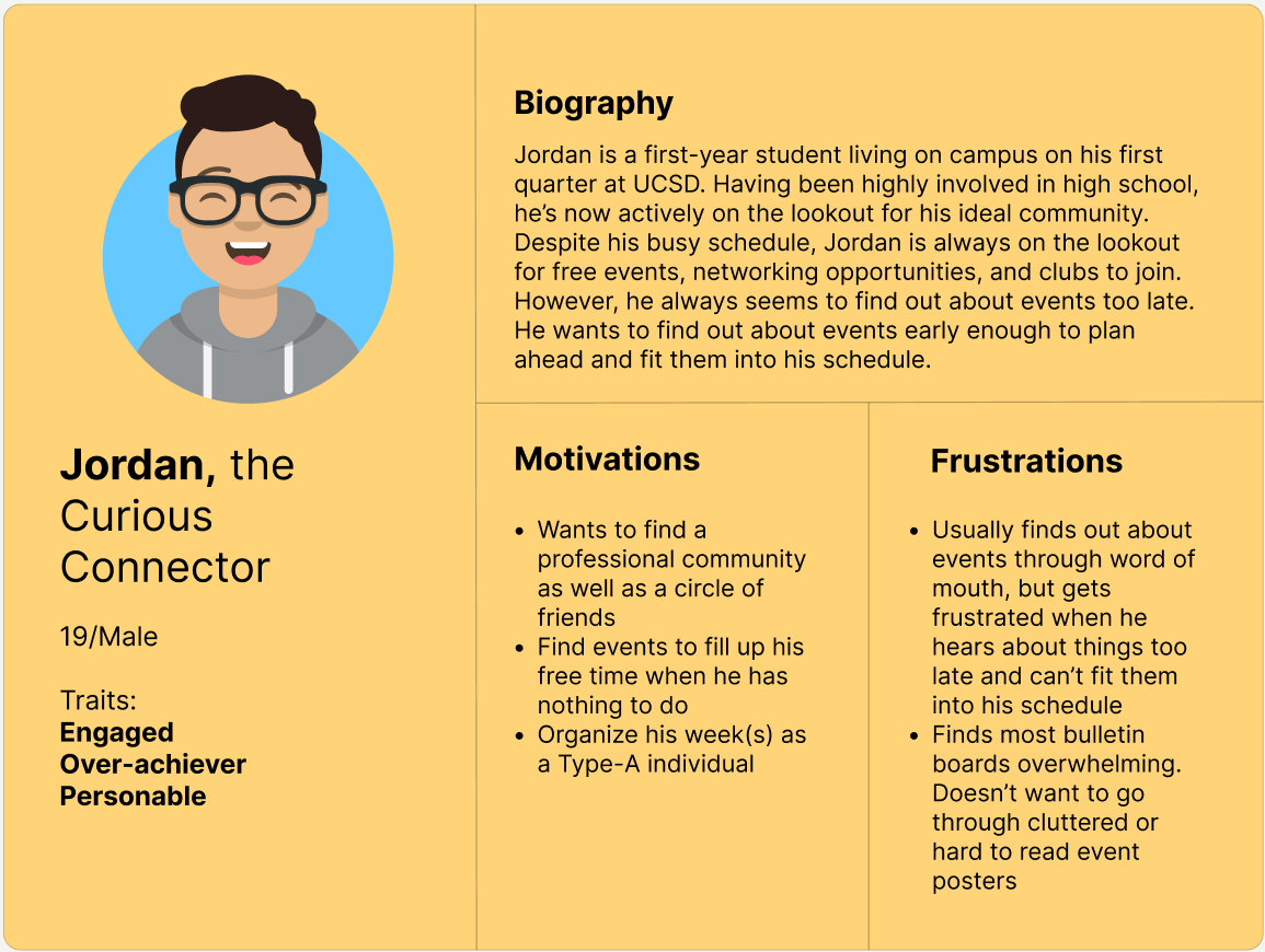
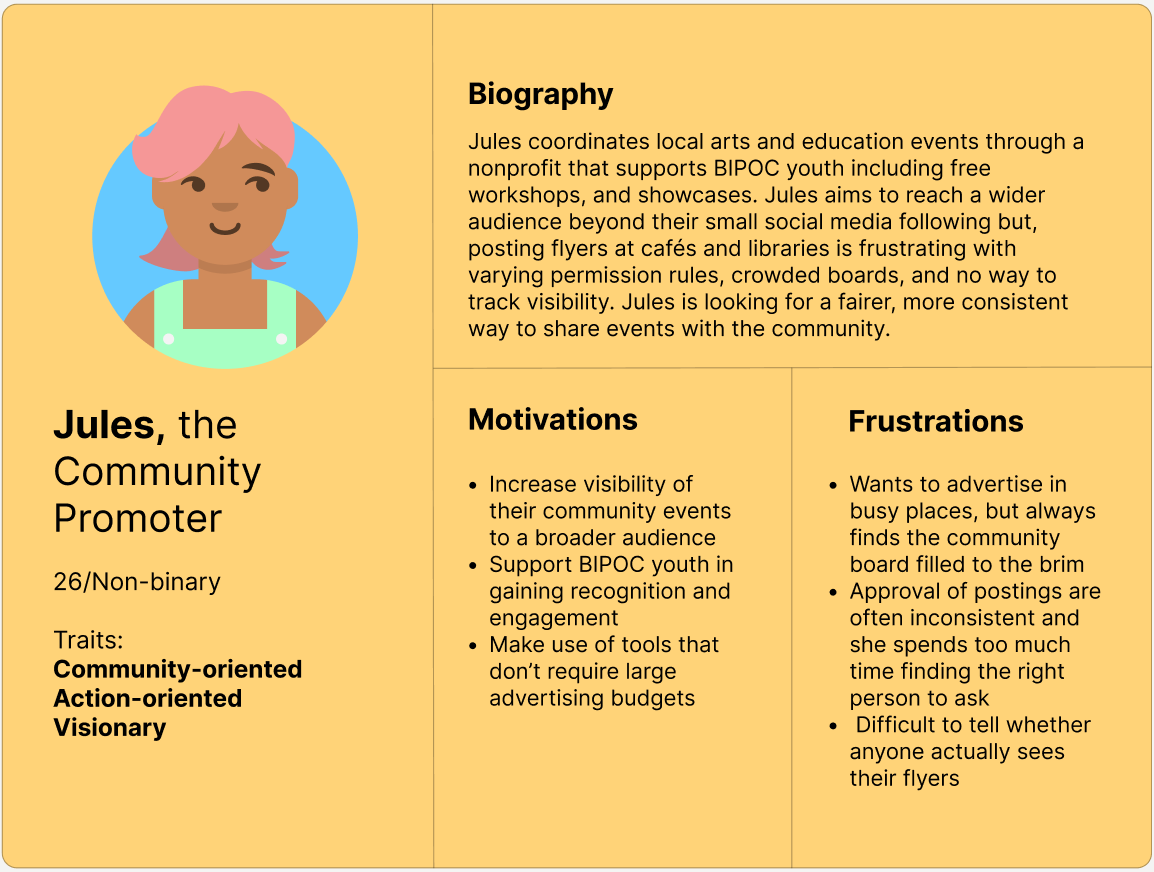
User Personas
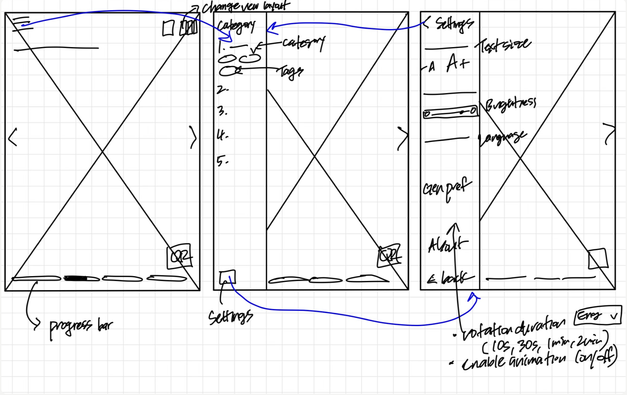
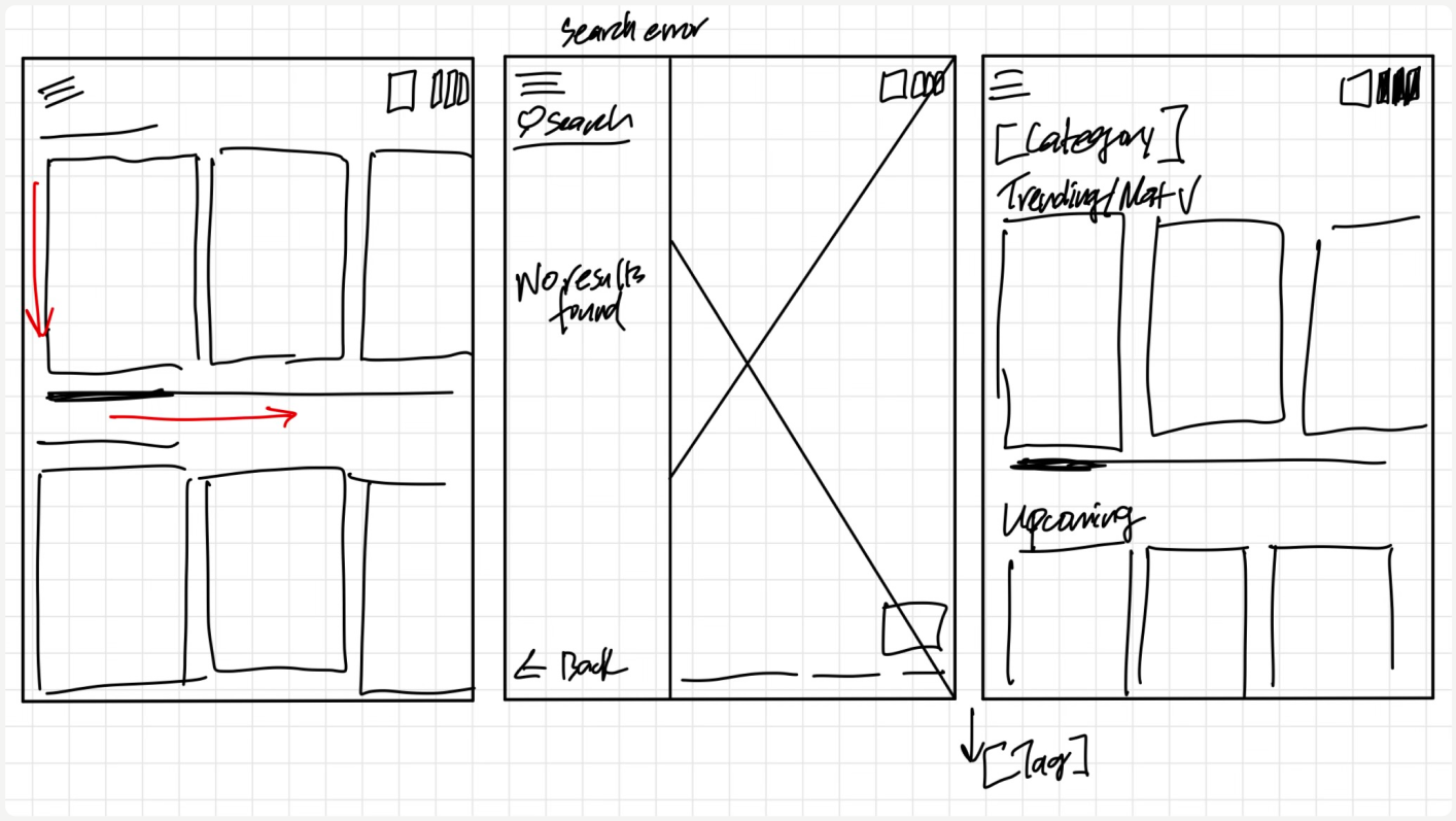
Paper Wireframes

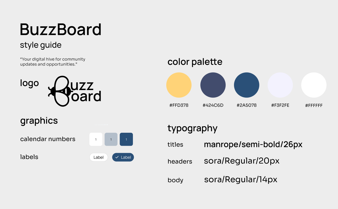
Style Guide
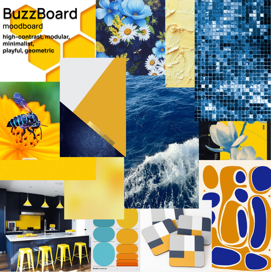
Moodboard
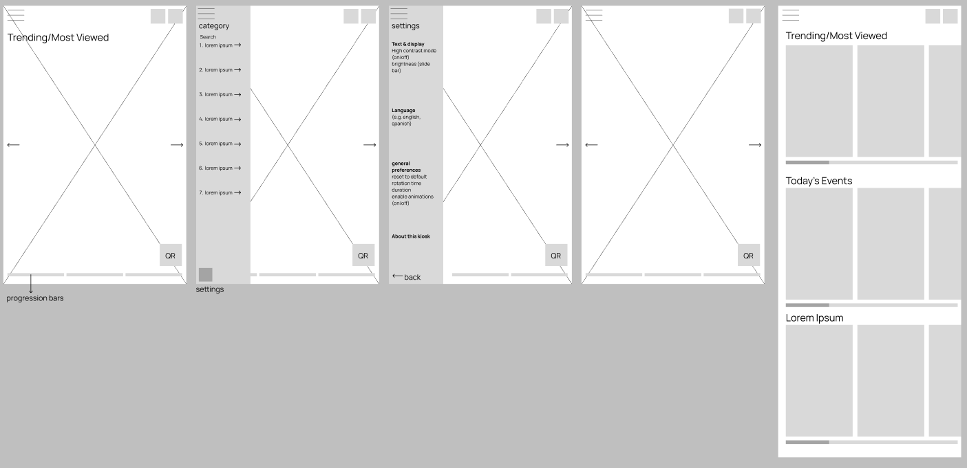
Low-Fidelity Wireframes
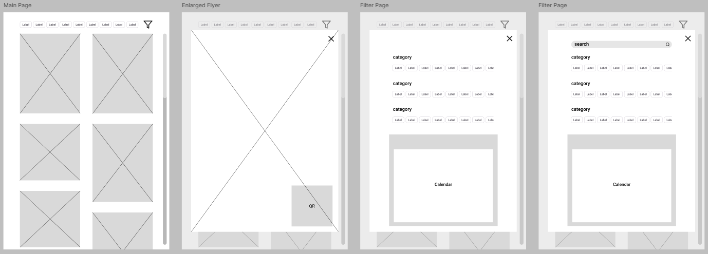
Mid-Fidelity Wireframes
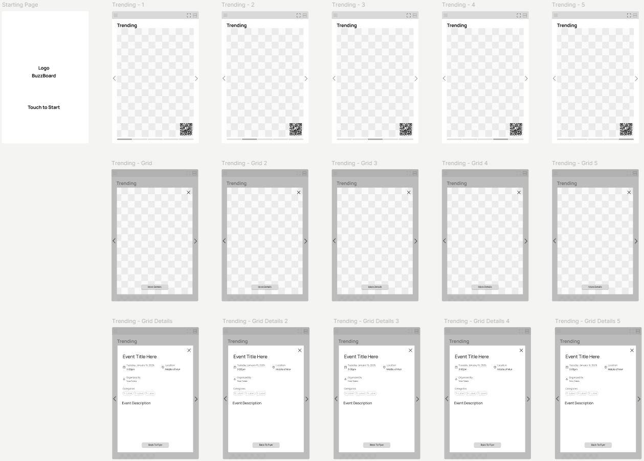

High-Fidelity Wireframes

Functionality
1
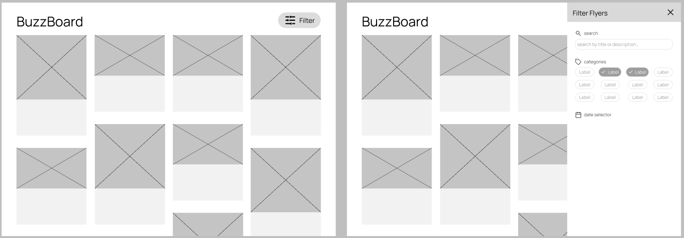
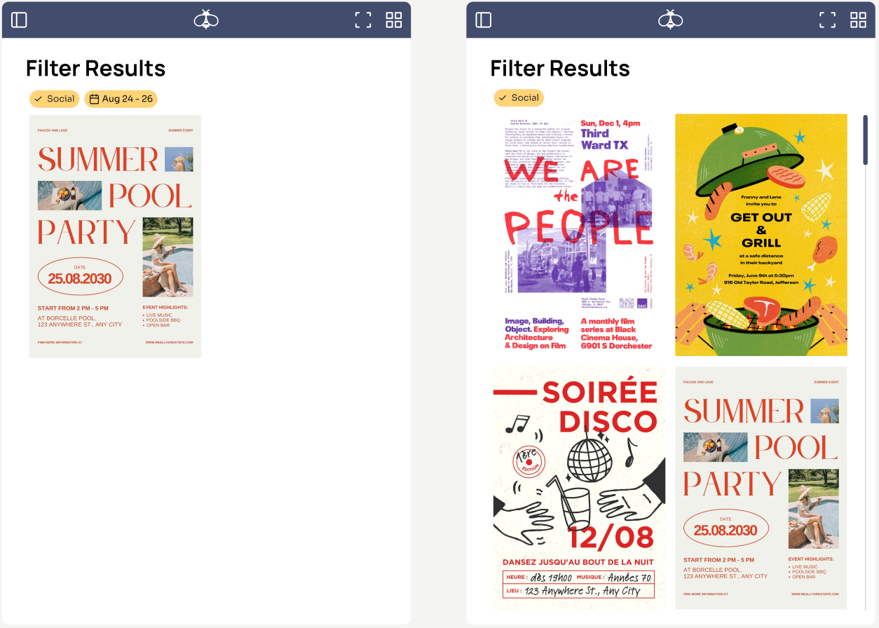
Smart Search & Filtering
Quickly find events through the responsive search bar and filtering system. Users can search by event titles or keywords while using customizable tags and dates.
2
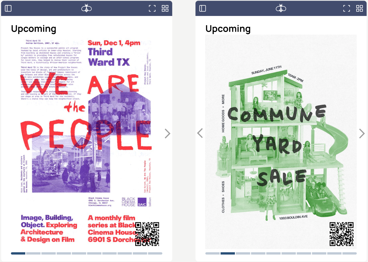
Flexible Browsing & Navigation
Smooth scrolling and drag interactions with the ability to switch between grid and single-view layouts.
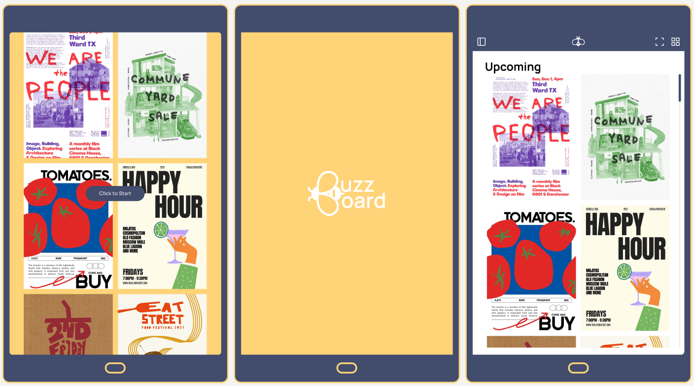
3
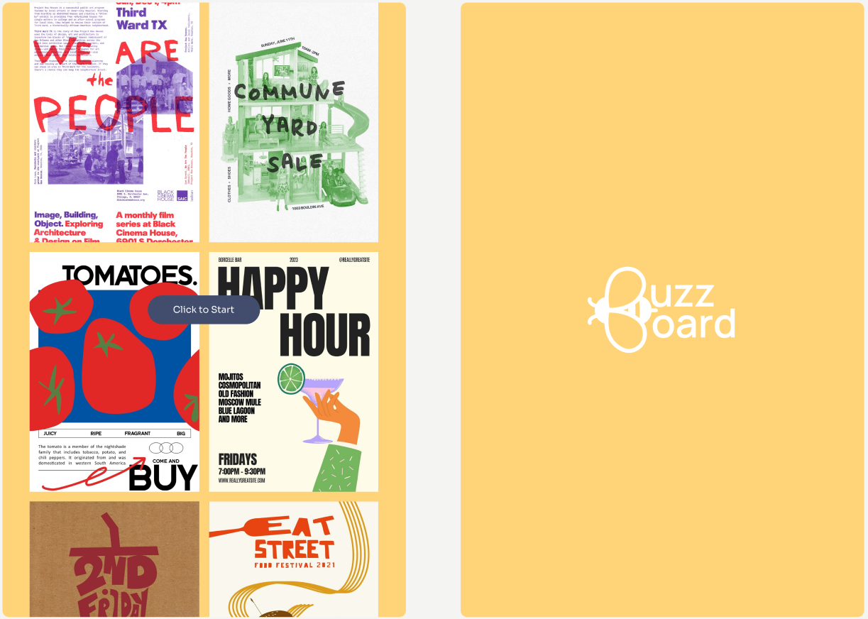
Visual Entry Point
An animated splash screen with an automatically scrolling grid of flyers and a pulsing “Click to Start” button signals interactivity.
4
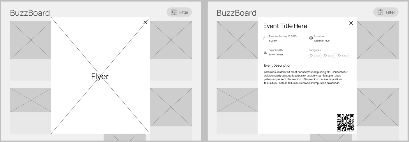
Event Details & Engagement
A flyer expands into a detailed view that provides essential information such as time, date, location, organizer, categories, and a full event description.
Future Improvements
1
Prioritize grid layout as the default view to support quick scanning in high-traffic environments, while still offering an optional expanded view for deeper browsing.
2
Refine the “More Details” page with better alignment of text and icons to improve readability and information flow. Support QR codes with short labels to increase engagement.
3
Preserve filter states when users reopen the categories tab, allowing them to pick up where they left off without restarting their search, and minimize typing effort.
4
Introduce features like “Save to Calendar” directly from the flyer details page to bridge the gap between discovery and action. Turn passive browsing into real-world participation.